Answer to readers about graphs:
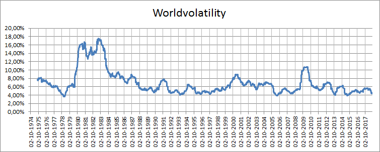
The top graph shows the evolution of the worldvolatility since 1974. An empirical observation that can be easily seen is that the values seem to stop decreasing around 4%. Why at 4%? That is unknown at this point, but it seems to hold as a worldvolatility low.
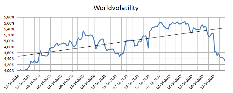
The bottom graph is just a zoom (in the long graph from 1974) from the last time the worldvolatility hit a 4% low , which was in the summer of 2014. The truncation of x axis at 4% is just to get a close up on the evolution of the worldvolatility.
So both graphs show the same evolution of the Worldvolatility, the bottom one being the close-up and the top one being the “big picture” from 1974.